
Table (display element)
 (only available for devices with a 32-bit CPU, like MKT-View III / IV)
- Display element type 'Table'
- Properties of a table (and components of the script data type 'tTable')
- Numbering of rows and columns in a table
- Data sources (defining 'what to display' in a table)
- Array as a data source
- User-defined script function as a data source
- Forced update (redraw) of a table (after modifications in the data source)
- Text alignment within a cell (left aligned, centered, or right aligned)
- Displaying special characters, e.g. checkmarks and checkboxes
- Events (generated by the 'table' element, handled in your script)
- OnTableClick( tTable ptr pTable, int iColumn, int iRow )
- OnTableScroll( tTable ptr pTable, int iNewTopColumn, int iNewTopRow )
- OnSelectCell( tTable ptr pTable, int iColumn, int iRow )
- OnGetCellText( tTable ptr pTable, int iColumn, int iRow, string ptr sText )
- OnGetEditText( tTable ptr pTable, int iColumn, int iRow, string ptr sText )
- OnSetEditText( tTable ptr pTable, int iColumn, int iRow, string ptr sText )
- Examples using the 'Table' element
- Syntax of a table-definition in a backslash sequence
See also:
- Manual of the UPT programming tool
- Manual for the script language (to define the contents of a table)
- Overview of other display elements supported by the 'User Programmable Terminals' (UPTs)
Display element type 'Table'
Introduction
The 'table' display element described in this document is only available in devices with a 32-bit CPU,
and only in combination with the script language. These features are available, for example,
in the MKT-View III and IV since February 2015.
A table can be inserted or edited (moved, resized) on a display page with the graphic page editor.
Tables may look as follows:
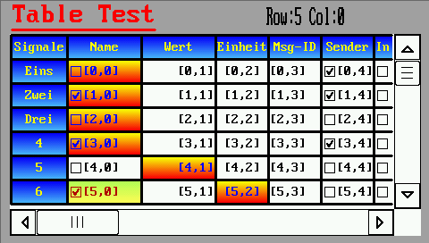
(Screenshot from application 'programs\script_demos\TableTest.cvt')
A table's appearance on the screen is controlled by a lot of properties which can be modified in the lower part of the tabsheet titled 'Display Line Properties' in the programming tool:
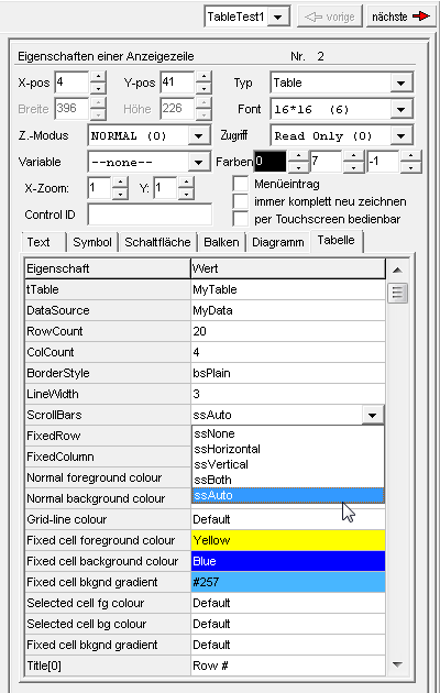
(Properties of a 'Table' in the UPT programming tool.
At the lower end of the 'Property-Liste', not visible in this screenshot,
are the names of the optional event handlers of a particular table )
General properties like position and size of the table (in a UPT display page),
colours, font, font size, etc are described in the UPT manual.
Properties like 'Access'
(access rights: Read/Write or Read-Only) and the option 'operable via touchscreen' can turn
the 'table' display element into a versatile, interactive controlelement,
e.g. certain lines, row, or cells of the table may become selectable or even editable by the operator.
At the right and lower edge of a table, optional scroll bars may appear,
for example if the space on the screen is not sufficient to show the entire content of the table.
A single-column table can be used as a selection list (there is no extra control element of this type in the UPT firmware).
The reaction ('what to do' when the operator selects a certain table row) is usually implemented
as an 'event handler' in the script.
Details about the events originating from a table are subject of a later chapter in this document.
The content of a table is not specified on the tabsheet shown above.
Instead, the table's contents are generated at runtime via script. The link between the visual 'table'
(on the screen) and the 'data source' (e.g. an array declared in your script)
is a script variable declared as tTable. In the examples presented below,
we will use the name 'MyTable' for that object. The declaration of the table (in the script) may look as follows:
var // global script variables ...
   tTable MyTable;       // control object for a 'visual' table element
   string MyData[5][3];  // an array of strings which will be displayed in a table [5 rows][3 columns]
endvar;
Apologies, but the developer didn't have the time to translate all parts of this document into proper English yet.
You may find a completely translated version at http://www.mkt-sys.de/MKT-CD/upt/help/table_01.htm (hopefully soon).
If that's not an option for you, try this well-known automatic translator.
Properties of a table
The table properties listed below are usually entered via programming tool during the design of a display page. Alternatively, they can also be modified at runtime via script (as component of a script variable declared as 'tTable') :| Property or component | Description | ||||||||||||
| tTable | Name of the script variable, declared as 'tTable'. The name of the variable must be known at design time, so the display [interpreter] knows which display element is connected to which script variable (because in a single application, there may be multiple, different tables). |
||||||||||||
| DataSource | Name or adress of a data source. This component can also be modified
via script, thus it's possible to switch between different 'sources' at runtime. |
||||||||||||
| RowCount | Number of rows displayed in the table, including the optional 'titel row'. | ||||||||||||
| ColCount | Number of columns displayed in the table, including the optional fixed coloumn with 'line numbers' (etc). | ||||||||||||
| BorderStyle | Defines the appearance of the outer frame (painted around the table). Possible values are implemented as constants in the script language: bsPlain : the table has no outer frame bsFramed : draw a simple frame (thin lines) around the table bs3D : frame with '3-D'-appearance bsRounded : rounded frame, similar as used in graphic buttons. |
||||||||||||
| LineWidth | Width of the vertical and horizontal separator lines. The recommended range is 1 to 3 [pixels]. | ||||||||||||
| Scrollbars | Defines if, when, and which scrollbars shall appear at the right and lower edge of the table. In the designer (UPT programming tool), the following values can be picked from a list: ssNone : Don't show any scrollbars ssHorizontal : Only show a horizontal scrollbar ssVertical : Only show a vertical scrollbar ssBoth : Always show both scrollbars ssAuto : Show scrollbars only when necessary (i.e. if the graphic area is too small to show all lines or columns) | ||||||||||||
| FixedRow | Defines what shall be displayed in the first "fixed" row: no fixed row : There is no 'fixed' row, all rows are normal data rows show colum titles: Fixed titles (Title[0]..Title[N], see below) show user data: show titles provided via script (data source) The type of the "fixed row" defined this way also has an influence on the numbering of columns and rows in the table ! | ||||||||||||
| FixedColumn | Defines what shall be displayed in the first "fixed" column: no fixed column : There is no 'fixed' column show row numbers : Show numbers (1 .. N) for all rows in the 1st column show user data: show strings provided via script (data source) The type of the "fixed column" defined this way also has an influence on the numbering of columns and rows in the table ! | ||||||||||||
| FgColor / "Normal foreground colour" |
Colour for text (characters) in 'normal' cells, separator lines, and frames. |
||||||||||||
| BgColor / "Normal background colour" |
Background colour for all 'normal' (non-fixed) cells. |
||||||||||||
| BgGradient / "Normal background gradient" |
Second background colour for an optional colour gradient in 'normal' cells. |
||||||||||||
| TitleFgColor / "Fixed cell foreground colour" |
Foreground colour for text in non-scrolling ("fixed") cells (e.g. title row and numbering column). |
||||||||||||
| TitleBgColor / "Fixed cell background colour" |
Background colour for non-scrolling ("fixed") cells. |
||||||||||||
| Fixed cell bkgnd gradient | Second background colour for an optional colour gradient in 'fixed' cells. |
||||||||||||
| SelectedFgColor / "Selected cell fg colour" |
Foreground colour for the momentarily selected or edited cell. |
||||||||||||
| SelectedBgColor / "Selected cell bg colour" |
Background colour for the momentarily selected or edited cell. |
||||||||||||
| Selected cell bknd gradient | Second background colour for an optional colour gradient for the selected cell[s]. |
||||||||||||
| Title[0..9] | Column titles displayed in the non-scrolling "titel row" | ||||||||||||
| ColumnWidth[0..9] | Column widths, measured in pixel. If these are not specified in the designer, the remaining space inside the table will be 'equally distributed', which means all columns will have the same width. |
||||||||||||
| SelRow | Number (index) of the currently selected table row ('line'). As usual for any kind of array-index, numbering usually starts at zero for the first 'data' row. See also: Notes about counting rows and columns in a table. |
||||||||||||
| SelColumn | Number (index) of the currently selected column. As usual for any kind of array-index, numbering usually starts at zero for the first 'data' column. See also: Notes about counting rows and columns in a table. |
||||||||||||
| SelMode | Selection Mode (e.g. to navigate in a table via rotary encoder button). Possible values are:
|
In addition to the properties listed above (editable in the designer on tabsheet 'Page #x' / "Display Line Properties", "Table"), the script in your application can control the following properties of the associated 'tTable' (script variable):
| X | Position of the table's left edge on the screen. Measured in pixels. In the designer, this property can be modified on the 'Display Line Properties' panel, or in the graphic editor. |
||||||||||||
| Y | Position of the table's upper edge on the screen. Measured in pixels. In the designer, this property can be modified on the 'Display Line Properties' panel, or in the graphic editor. |
||||||||||||
| Width | Total width of the table, measured in pixels. |
||||||||||||
| Height | Total height of the table, measured in pixels. |
||||||||||||
| RedrawFlags | May be used to force re-drawing of the table. This may be necessary,
for example, if the script has modified the contents of the 'data source' (array) associated with this table.
The value which the script may assign to the 'RedrawFlags' is a bitwise combination of the following constants:
|
||||||||||||
| CurrFgColor | Current foreground colour, used when painting a single cell. This component of tTable can only be modified in an OnGetCellText event handler. The default value depends on the state of the cell that is currently being painted: It is FgColor for 'normal' data cells, TitleFgColor for non-scrolling cells, or SelectedFgColor for selected cells. |
||||||||||||
| CurrBgColor | Current background colour, used when painting a single cell. This component of tTable can only be modified in an OnGetCellText event handler. The default value depends on the state of the cell that is currently being painted: It is BgColor for 'normal' data cells, TitleBgColor for non-scrolling cells, or SelectedBgColor for selected cells. |
||||||||||||
| CurrBgGradient | Second background colour, used when painting a gradient-fill in the background of the current cell. This component of tTable can only be modified in an OnGetCellText event handler. The default value depends on the state of the cell that is currently being painted: It is BgGradient for 'normal' data cells, TitleBgGradient for non-scrolling cells, or SelectedBgGradient for selected cells. |
Counting (numbering) rows and columns in a table
General rule: The numbers (indices) of data rows and data columns in a table start at zero,
as in a two-dimensional array in the script language.
Thus, cells in the data area are addressed by their zero-based indices.
Because the optional "column titles" and "row numbers" are usually not read as "values"
from the array or data shource, those fixed (non-scrolling) cells
at the left and upper edge of the table are numbered as follows:
- With the option FixedRow = 'show user data', the non-scrolling "title"-row at the top of the table is accessable as row index zero (so it can be addressed like a 'normal' data row from the array aka 'data source');
- With the option FixedRow = 'show column titles', the non-scrolling "title"-row at the top of the table
will have a 'dummy row index' of -1 (minus one) when calling an event handler like OnGetCellText.
- With the option FixedColumn = 'show user data', the fixed (non-scrolling) column at the left edge of the table is accessable as column index zero (so it can be addressed like a 'normal' data column from the array aka 'data source');
- With the option FixedColumn = 'show row numbers', the non-scrolling "numbering"-column at the left edge of the table
will have a 'dummy column index' of -1 (minus one) when calling an event handler like OnGetCellText.
Data sources (for the display in a table)
Arrays as data source for a table
In the most simple case, a table's data source is just an array of text strings.
Example:
var
   string MyData[5][3];  // array displayed in a table [5 rows][3 columns]
endvar;
The above example declares a two-dimensional array named 'MyData'.
When displayed as a table, the table show have at least 5 lines (rows), and 3 columns per line, with the following array indices:
| iColumn = 0 | iColumn = 1 | iColumn = 2 | |
| iRow = 0 | MyData[0][0] | MyData[0][1] | MyData[0][2] |
| iRow = 1 | MyData[1][0] | MyData[1][1] | MyData[1][2] |
| iRow = 2 | MyData[2][0] | MyData[2][1] | MyData[2][2] |
| iRow = 3 | MyData[3][0] | MyData[3][1] | MyData[3][2] |
| iRow = 4 | MyData[4][0] | MyData[4][1] | MyData[4][2] |
- Note:
- As common in most (unfortunately not all) programming languages,
we start counting array indices at zero here.
In the two-dimensional array shown above, the first index is the row (~line), followed by the column index.
Much in contrast to Borland Delphi ("TStringGrid::OnSelectCell(..ACol,ARow,.."), the sequence
"row first, column second"
will also be used when passing those indices as 'iRow' and 'iColumn' to Event Handles, e.g.:
func OnMyTableGetCellText( tTable ptr pTable, int iRow, int iColumn, string ptr sText )
See also: Numbering principle of rows and columns in a table's data area.
Other data types suitable for direct display in a table are integer (int) and floating point numbers (float).
To show other data types in your table, implement your own function in the script, to convert 'whatever you want' into a displayable format. More on that in the next chapter.
Self-defined script functions as data source for a table
For large tables, it's not economical to keep the values (display strings) for all cells
as a multi-dimensional array up-to-date in memory (all the time). For example, if the visible table area
only contains a dozen lines, but hundreds of other lines are scrolled 'out of view', it's advisable
to use a self-defined function (in the script) as the table's data source.
This function (in geek speak: the table's OnGetCellText-handler)
will only be called to retrieve the text for all visible lines, when the table needs to be
redrawn.
With a function as data source, a table can also be used as a 'checklist'.
Forced redrawing of a table
After script-controlled modifications in the data source, or similar events which may affect
the appearance of anything shown in the table (e.g. checkmarks), it may be necessary to redraw
the table. Especially if a self defined function acts as a data source, that function
will not be periodically be called by the system (firmware) just to find out if 'anything has changed'.
Instead, the script can initiate re-painting of the table 'as soon as possible'
by setting the flag tTable.RedrawFlags.
Aligning text within a cell
The text shown in any cell of the table can be aligned in different ways, regarless of the type of the table's data source (array or function). Without an explicit alignment type, fixed cells like headlines and line numbers are horizontally centered in their cells, while normal 'data' cells are left-aligned by default.If necessary, a different alignment can be enforced by prefixing the text with one of these backslash sequences:
- \al (align left)
- First character at the left edge of the cell.
This is the default for normal (scrollable) cells. - \ar (align right)
- Last character at the right edge of the cell.
- \ac (align center)
- Text aligned in the center of the cell.
This is the default for all 'fixed' (non-scrolling) cells, e.g. column titles and line numbers.
Displaying special characters, like checkmarks and checkboxes
The following backslash sequences can be used in a table's cell text to show special characters:- \cm (checkmark, ✓ )
- Draws a checkmark without a box.
Equivalent to the Unicode character 'CHECK MARK' (U+2713)
- \CM (checkmark, ✔ )
- Draws a 'heavy' (bold) checkmark, without a box.
Equivalent to the Unicode character 'HEAVY CHECK MARK' (U+2714)
- \cb (checked box, ☑ )
- Draws a 'checkmark in a box'.
Equivalent to the Unicode character 'BALLOT BOX WITH CHECK' (U+2611)
- \ce (checkbox, empty ☐ )
- Draws an 'empty checkbox' (box without checkmark, like "\be", U+2610).
- \be (box, empty; ☐)
- Draws an 'empty checkbox' (box without a checkmark).
Equivalent to the Unicode character 'BALLOT BOX' (U+2610)
- \bc (box, checked; ☑)
- Draws a checkmark in a box, like "\cb".
Equivalent to the Unicode character 'BALLOT BOX WITH CHECK' (U+2611)
- \bx (box with X, ☒)
- Draws a box with an 'X' (cross) inside.
Equivalent to the Unicode character 'BALLOT BOX WITH X' (U+2612)
To show them in certain cells of your table, use an OnGetCellText-handler which inserts a suitable character before the item text (e.g. "\cb Coffee").

Example: Table used as a script-controlled 'checklist'
- Note
- Other backslash sequences which you possibly know from other (non-tabular) display elements,
like 'printing' characters via \chr( <char-code> ), do not work in the text drawn in a table cell.
See also: Check Buttons (single checkable buttons).
Events (originating from user actions in a table, processable via script)
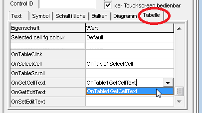
For special applications, your script may contain a few functionen to implement special 'behaviour' of the table, as explained in this chapter.The names of those optional event handlers are entered in the table's property list. If suitable functions already exist in your script, they will be listed in a drop-down box when clicking on the "small triangle pointing down" ( ▼ ) in the property list.
If a handler has already been set for a certain event in the property list shown below, you can switch to the handler's implementation via double click on its name.
(Selection of event handlers at the end of a table's property list in the programming tool)
OnTableClick( tTable ptr pTable, int iRow, int iColumn )
This handler will be invoked when the operator presses the touchscreen on a certain cell, or presses the rotary encoder knob while the focus is on a certain cell. Not to be confused with the OnSelectCell-handler, which is invoked when the input focus changes from one cell to another by turning the MKT-View's rotary encoder knob !To avoid unintended reactions, a cell is only considered 'clicked' via touchscreen if the touch screen coordinate is in the same cell when pressing and releasing the touchscreen. Also 'wiping' to neighbouring cells (without lifting the pen or finger) causes the system (firmware) not to invoke the script's "OnTableClick"-handler when releasing the finger.
Example for an "OnTableClick"-handler (from application 'programs\script_demos\TableTest.cvt') :
var
   int Checked[200];  // array with our own 'checked'/'unchecked' flags shown in the table
endvar;

       ...

func OnTable1Click( tTable ptr pTable, int iRow, int iColumn )
  if( iColumn==0 ) and (iRow>=0) then        // data column with a checkbox ?
     Checked[ iRow ] := not Checked[ iRow ]; // invert checkmark state
     pTable.RedrawFlags := cRedrawAll;       // update the table's display a.s.a.p.
     return TRUE; // TRUE -> "have processed the event HERE" (don't call the default handler)
  endif;
  return FALSE;   // FALSE -> "let the system process this event"
endfunc; // OnTable1Click()
The example uses a simple array (int Checked[200]) to store the states for all checkboxes (or the visibility of their 'checkmarks'). These are used in the demo's OnGetCellText-Handler (not shown here) to put a checkmark character before the normal text shown in certain cells.
OnTableScroll( tTable ptr pTable, int iNewTopRow, int iNewTopColumn )
Will be invoked when the operator (user) moves any of the table's scrollbars.
The "cell coordinate" (iNewTopRow, iNewTopColumn) passed as a function argument applies to the first visible data cell,
appearing near the table's upper left corner.
OnSelectCell( tTable ptr pTable, int iRow, int iColumn )
This handler will be called when the operator selects a new cell, either by turning the rotary encoder knob,
or by touching a new (different) cell in the table's data area, i.e. whenever the selection changes.
Note: Just scrolling the table doesn't modify the current selection
- the selected cell may even be scrolled 'out of view' by the operator !
When selecting a different cell by turning the encoder knob, or (on devices with a real keyboard) via cursor keys,
then the table will automatically be 'scrolled into view' to make the new selection visible.
Thus, there is usually no need for a self programmed 'OnSelectCell'-handler in your script.
A typical use for an 'OnSelectCell'-handler could be to show additional information about the currently
selected cell 'somewhere else' (outside the table).
See also: OnTableClick .
OnGetCellText( tTable ptr pTable, int iRow, int iColumn, string ptr sText )
With this event handler, a script can 'override' the text shown in any cell of the table,
regardless of what is currently in the data source.
When implemented, the OnGetCellText-handler will be invoked many times (for each visible cell) when
re-painting the table on the display.
If the handler returns FALSE, the system considers the event was not handled,
and shows the normal value (string, integer or whatever) from the data source or array associated with the table.
If the handler returns TRUE, the table will show the string passed back
from the handler in the 4th function argument (sText).
Example (from programs/script_demos/TableTest.cvt):
func OnMyTableGetCellText( tTable ptr pTable, int iRow, int iColumn, string ptr sText )
  if( iColumn==0 ) then // first data column ?
    select iRow
      case 0:  sText := "Zero";   return TRUE;
      case 1:  sText := "One";    return TRUE;
      case 2:  sText := "Two";    return TRUE;
      case 3:  sText := "Three";  return TRUE;
    endselect; // iRow
  endif; // iColumn==0 ?
  return FALSE;  // FALSE -> "let the system provide the cell text"
                 // (usually by reading it from the associated ARRAY)
endfunc; // OnMyTableGetCellText()
Note: The sequence of passing 'row' and 'column' in the argument list is deliberately incompatible
with Borland Delphi's TStringGrid ! In the script event handlers, we...
"first pass the row index, then the column index" (similar as for the data sources).
Since 07/2016, the OnGetCellText handler can also be used to control the colours for individual cells.
You can assign any fore- or background colour to the following members of a tTable in your OnGetCellText handler:
pTable.CurrFgColor ("foreground colour of the currently painted cell"),
pTable.CurrBgColor ("background colour of the currently painted cell"),
pTable.CurrBgGradient ("second colour for a gradient in the currently painted cell").
There is an overly simple example in programs/script_demos/TableTest:
func OnMyTableGetCellText( tTable ptr pTable, int iRow, int iColumn, string ptr sText )
  // ...
  // Simple test for "individually coloured cells" (since 2016-07-26) :
  if( iColumn==iRow ) then
     pTable.CurrFgColor := clBlue;   // override the 'current' foreground colour when painting this cell
     pTable.CurrBgColor := clYellow; // override the 'current' background colour when painting this cell
     pTable.CurrBgGradient:= clRed;  // 2nd background colour for a colour gradient when painting this cell
  endif;
  // ...
endfunc; // OnMyTableGetCellText()
Since 08/2016, an OnGetCellText-handler can also be used to show special characters, for example
checkboxes in any cell of the table, as in this code fragment
from programs/script_demos/TableTest.cvt:
  if((iColumn==0 ) or (iColumn>=4)) and (iRow>=0) then // here: a colum with interactive checkmarks
    if( Checked[iRow] bit_and (1<<iColumn) ) then   // array with our own checked/unchecked flags
       sText := "\cb" + MyData[iRow][iColumn];  // "\cb" = checked box
    else
       sText := "\ce" + MyData[iRow][iColumn];  // "\ce" = checkbox, empty
    endif;
    return TRUE;   // use sText, not the normal cell text from the data source
  endif;
Resulting display (example)
after 'checking' a few items
Like any other display element, a table will only be re-painted into the framebuffer when necessary (from the display interpreter's point of view). Because the handler shown above is only called when painting the table, your script needs to inform "the table" that it needs to redraw itself:
MyTable.RedrawFlags := cRedrawAll; // table data have been modified, update the table's display a.s.a.p.
OnGetEditText( tTable ptr pTable, int iRow, int iColumn, string ptr sText )
Planned (for future releases) :
OnGetEditText() will be called shortly before a cell is switched into Edit mode.
With this handler, the script has the chance to update the 'default value', different from the value
currently stored in the table's data source.
OnSetEditText( tTable ptr pTable, int iRow, int iColumn, string ptr sText )
Planned (for future releases) :
OnSetEditText() will be called when the edited value (edited in a cell of the table) shall be
written back into the data source (which, after editing, becomes a 'data sink', i.e. destination).
If and how the edited value will be 'written back' is entirely under control of your script.
Examples using the 'Table' display element
The installer contains a few examples using the 'table' element (subdirectory programs/script_demos):
- TableTest.cvt
- A simple example, used for most screenshots in this document.
Contains event handlers for OnSelectCell, OnTableClick, and OnGetCellText to show normal text and interactive checkboxes in a table.
- ReadDir.cvt
- This example reads the memory card's root directory and lists it as a table.
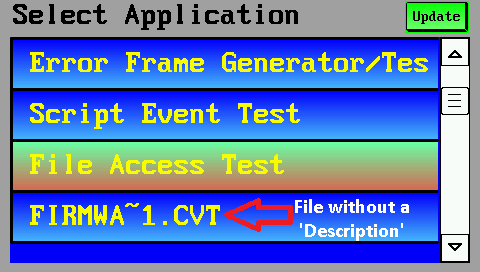
- AppSel_1.cvt
- The 'App-Selector' uses a table to show
all *.cvt files found on the memory card.
The operator (user) can select one of those applications via touchscreen or rotary encoder to launch it.
Syntax of a table definition in a backslash sequence / 'display definition line'
(only for developers and advanced users)
Internally, the entire table definition (design parameters) are encoded as a backslash sequence.
The display interpreter (part of the UPT device firmwar) parses this sequence from the
format strings, as in any other display line definition.
If you prefer to create display pages for your application with a text editor, instead of defining them
with the dialogs, panels, and property lists in the programming tool, here is the general syntax
of a 'table' element:
! ! ! t.b.d. ! ! !
Syntax:
\table( <Script-Variable> [, <key> = <value>, ... ] )
The first argument (after the opening parenthesis) is the name of the script variable (type tTable).
It is followed by a list of key/value pairs, most of them optional, separated with an equal sign (=) between key (name)
and value.
Example:
\table(MyTable,ds=MyData,rc=200,cc=10,lw=3, .... ,t0="Row #",t1="Sig Name", .... ,osc=OnMyTableSelectCell)
In the backslash sequence, most key names are abbreviated with a one to three character token, as shown below:
| Property | Token | Description |
| DataSource | ds | data source (supplies the values "to be shown in the table") |
| RowCount | rc | Number of rows in the entire table |
| ColCount | cc | Number of columns in the entire table |
| BorderStyle | bs | Style for painting the table's outer border (frame) |
| LineWidth | lw | Width of the grid lines between cells within the table |
| FixedRow | fr | Defines the usage of the first row ('fixed' or scrollable, etc) |
| FixedColumn | fc | Defines the usage of the first column ('fixed' or scrollable, etc) |
| FixedRowHeight | frh | Height of the first row (e.g. with the 'column titles') in pixels |
| DataRowHeight | drh | Height of all other rows (e.g. with 'normal data') in pixels |
| Scrollbars | ss | Defines if (and which) scrollbars shall be visible |
| Title[0..9] | t0 .. t9 | Column titles (shown in the first, 'fixed' row) |
| ColumnWidth[0..9] | w0 .. w9 | Column widths in pixels |
| otc | Name of the optional "OnTableClick"-handler | |
| ots | Name of the optional "OnTableScroll"-handler | |
| osc | Name of the optional "OnSelectCell"-handler | |
| ogc | Name of the optional "OnGetCellText"-handler | |
| oge | Name of the optional "OnGetEditText"-handler | |
| ose | Name of the optional "OnSetEditText"-handler |
In the interest of compatibility with future extensions, unknown key/value pairs are simply skipped (ignored) by the parser; there will be no error message if there's a typo in a parameter's name. The UPT programming tool assembles a list of key/value pairs automatically, from the property list shown on the 'table' tab; typos cannot happen there.
Examples:
-
\table( MyTable, rc=5,cc=2,t0="Parameter",t1="Unit",t2="Value") -
Draws a table using script variable 'MyTable', with 5 lines (RowCount), 3 columns (ColCount), and three pre-defined
column titles (t0=titel of the first column; array indices begin at zero), etc).
Since no column widths are defined, all columns will have the same witdth, approximately one third of the entire table width.
-
\table( MyTable, rc=5,cc=2,w0=80,w1=20) -
Draws a table, again using script variable 'MyTable', ... , without predefined column titles.
The widths of the first two columns are fixed (here: 80 and 20 pixel), thus the width of the third column will be automatically determined ( ~ table width minus width of the other columns, minus width of the optional vertical scrollbar).
- Note:
-
Don't try to place other display elements in the same definition line (besides the /table).
The total width and height of the table is not a specific property of the 'table' element,
but a property which (almost) all other display elements have.
Such non-table-specific properties (position, size, font) are not encoded in the
argument list after "\table", but (for example) in the upper part of the tabsheet
Display Line Properties.
Last modifications:
2016-08-16: Added backslash-sequences for special characters and alignment in table cells.
2015-09-28: Translated parts of this document from German to English.
2015-01-27: Implementation of event handlers for 'tables'.
2014-09-29: Started development of the 'table' element.